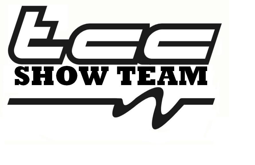
New TCCST Logo......
 30-Oct-2005, 11:22 PM
#41
Guest
Posts: n/a
Originally posted by BBProductions
we need soemthing period to grab peoples attentioon @ shows...
cars pumping audio, decent banners, flyers, ect...
we need soemthing period to grab peoples attentioon @ shows...
cars pumping audio, decent banners, flyers, ect...
30-Oct-2005, 11:29 PM
#42
Registered User
Join Date: Feb 2005
Location: Durham Region
Posts: 2,548
Originally posted by Tego
Models, DJ's, banners, and etc etc
Models, DJ's, banners, and etc etc
i mean it brings attention... period...
cause everyone sitting on lawn chairs for 8rs plus isn't appealing to people... imo of course
 30-Oct-2005, 11:33 PM
#43
Senior Member

Join Date: Dec 2003
Posts: 23,881
I dont think the whole "civic" thing is that appealing to people...until people start doing things different or BIG its gonna be the same **** all the time, new logo or not
31-Oct-2005, 12:16 AM
#44
Guest
Posts: n/a
Originally posted by CyniKal.Mindset
I dont think the whole "civic" thing is that appealing to people...until people start doing things different or BIG its gonna be the same **** all the time, new logo or not
I dont think the whole "civic" thing is that appealing to people...until people start doing things different or BIG its gonna be the same **** all the time, new logo or not
31-Oct-2005, 04:55 AM
#45

Originally posted by BBProductions
we need cars to stand out @ shows not stickers...
we need cars to stand out @ shows not stickers...
31-Oct-2005, 08:00 AM
#46
Senior Member
Join Date: Dec 2003
Posts: 23,881
Originally posted by Cantonagod
Just because it is not appealing to you and your pimp mobile anymore doesn't mean it isn't appealling to the rest of us..
Just because it is not appealing to you and your pimp mobile anymore doesn't mean it isn't appealling to the rest of us..
Personally, something simple and clean like the current one would work best, clean simple font, not too oversized...I'm sure yall will figure it out tho
31-Oct-2005, 08:22 AM
#47
Guest
Posts: n/a
The logo is for us. It will draw attention if someone is already looking, not the reason someone is looking.
31-Oct-2005, 10:25 AM
#48
Senior Member
Join Date: Dec 2003
Posts: 23,881
ah...well then...I still like the simple and plain ones...fancy font make it look cheap...I kinda favor marco's with the reverse "T" at the end
31-Oct-2005, 10:38 AM
#49
Registered User
Join Date: Feb 2005
Location: Durham Region
Posts: 2,548
Originally posted by CyniKal.Mindset
ah...well then...I still like the simple and plain ones...fancy font make it look cheap...I kinda favor marco's with the reverse "T" at the end
ah...well then...I still like the simple and plain ones...fancy font make it look cheap...I kinda favor marco's with the reverse "T" at the end
 yeah personally i like it too...
...
remember too thin of a font will not work for vynil process, as it is too thin to cut, and not visible to the eye.
i have to agree the writing in mine is thin but thats just an example font...

or exclude it ll together...

..
weird how some people want something clean looking, other want fancy scrippt / font etc..
 31-Oct-2005, 11:23 AM
#50
Registered User
Join Date: Jan 2005
Posts: 1,030
I like that better than what I had drawn up. I like the writing, but I think it'll be too thin for the vinyl. Don't forget, most of the vinyls will be a 4x6ish size. For larger ones like the one you photoshopped onto your car...the writing would look good because the font would be bold enough to put to vinyl. But for the smaller one.....ya...the writing wont work. Besides, it'd look too clutterred on the small vinyls.
IMO
IMO
31-Oct-2005, 11:44 AM
#51
Registered User
Join Date: Feb 2005
Location: Durham Region
Posts: 2,548
Originally posted by Gutro
I like that better than what I had drawn up. I like the writing, but I think it'll be too thin for the vinyl. Don't forget, most of the vinyls will be a 4x6ish size. For larger ones like the one you photoshopped onto your car...the writing would look good because the font would be bold enough to put to vinyl. But for the smaller one.....ya...the writing wont work. Besides, it'd look too clutterred on the small vinyls.
IMO
the current logo font issmall as well
31-Oct-2005, 11:52 AM
#52
Registered User
Join Date: Jan 2005
Posts: 1,030
I think it'd be better without the font. Simply TCCST. Most of us have TCC tags anyways. What if we made the text simply SHOW TEAM. Most of us have TCC tags anyways and that says it's the Toronto Civic Club.
I don't have illustrator or photoshop at work, but here's my vission.
TCCST the way Marco has it with "Show Team" accross the center. Less writing allows for bolder font for the vinyl.
Just a thought
I don't have illustrator or photoshop at work, but here's my vission.
TCCST the way Marco has it with "Show Team" accross the center. Less writing allows for bolder font for the vinyl.
Just a thought
31-Oct-2005, 12:00 PM
#53
Registered User
Join Date: Feb 2005
Location: Durham Region
Posts: 2,548
whatever works, n e thing will be better then the current logo, doesn't flow at all with n e thing
...
but imo would be great to have something that we can use in universal applications, cause the current one if blown up or stretched would just cover your whole indow or trunk
...
but imo would be great to have something that we can use in universal applications, cause the current one if blown up or stretched would just cover your whole indow or trunk
31-Oct-2005, 12:39 PM
#54
Senior Member
Join Date: Dec 2003
Posts: 23,881
plus I still want a tccst decal for the caddy "toronto civics club support team"
31-Oct-2005, 07:49 PM
#55
Registered User
Thread Starter
Join Date: Jul 2003
Posts: 4,197
the whole point of this thread was to invite members to put forth their ideas for creating the new TCCST logo.
As has been the norm, every thread goes so far from it's original design that it was best to let this thread venture off on it's own (note post whoring and off topic topics) and then once we have enough logo's to consider we will then decide as a team on them in a new thread.
The entires will be taken from this thread (not easily taken from my PM or e-mail which was why the submission process was requested in that format (thank you BBProductions for reading)) and a new thread will be created..
thank you for the submissions to date..
Marty and Mandie
 06-Nov-2005, 10:56 PM
#57
Senior Member

Join Date: Mar 2005
Posts: 6,176
Jeff.. that one looks good.
06-Nov-2005, 10:59 PM
#58
Guest
Posts: n/a
Thank you. I like the one I did or Marcos without the words, at least where they are.


